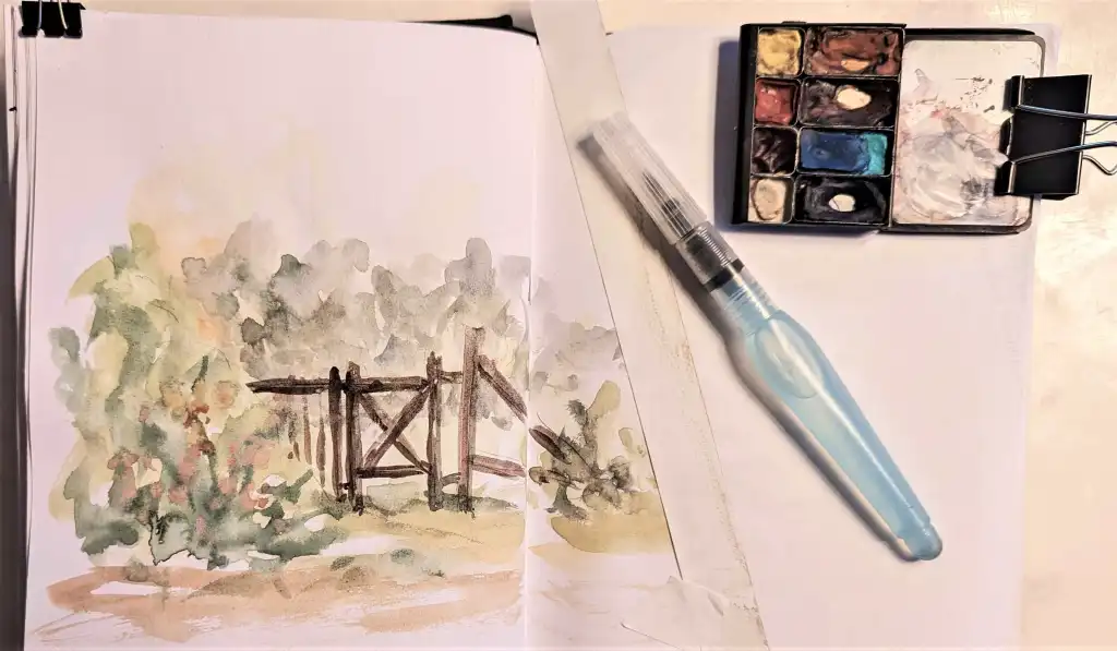
Only 16 “Look at That! ™ Art Pouches” left!

I have been busy at work since you last heard from me in January. Here are the highlights:

Yesterday I uploaded images of the last of my handwoven, handsewn, designed-by-me Art Pouches. The sixteen pouches that are available now are the last there will ever be! Things are changing quickly for me, and I am moving on to new adventures. That is why you need to order your Art Pouch now while this elite supply lasts. They range from $28USD to $35USD and my Etsy shop will close as soon as these are sold. (Shipping only in USA, sadly.)

Here is the link to the story about them: https://aloftwithinspiration.com/look-at-that-art-pouch-store/

And the direct link to the Etsy shop: https://www.etsy.com/shop/lookatthatartpouch/?etsrc=sdt

On another exciting note, my next book is almost done!

The Second Edition of Look at That! is twice as long as the first edition – 140 pages instead of the original 72. It is reorganized and expanded, covering all the basics that are in the first version, and also featuring The Eight Secrets of Watercolor Success, three ways to create an easy, inexpensive plein air support board, and much more. This labor of love will be released as a hardcover (very exciting) as well as an eBook. The original paperback (which has sold over 12,000 copies worldwide since its publication in 2020) will also remain available.

That’s all for now. This book is in the final stages of graphic design (I am being skillfully assisted by a phenomenal editor/designer/tech genius woman!) and with luck it should be available within a few weeks. Stay tuned!

Now it’s time for you to check out those Art Pouches… and get outside sketching!

*******

Feel free to forward this post to anyone you think might enjoy it.

If you find these posts valuable, please consider making a contribution of any size to The Tip Jar. It is a secure site, it helps keep this website solvent, and is greatly appreciated!

 Questions? Comments? Public comments can be posted below.

 Private questions or comments will reach me by using the Contact link here.

 And, as always, thanks for spending some time “aloft”!

Posted in 2- Bolts: Sketching Tools, Beauty, Look-at-That! Pouches, Second Edition of Look at That!, Writing | Tagged , , , , , , | 5 Comments

Learning to Trust Your Creative Instincts

Sometimes when I am in the middle of painting a watercolor, a voice inside nudges me to take a photo midway through. Perhaps I have hit a place of hesitation, and I want a record of what it looked like “before I ruined it.” Often, though, it’s because I know I will want to show the painting’s many stages to my watercolorist friends when next we meet. Those friends fall into three groups:

1: the members of my Tuesday in-person watercolor group,

2: the future readers of the book I’m working on right now, or

3: I could share it with you here in a blog post on my website.

The good news? When I’m feeling exceptionally eager, it ends up here. Instant gratification!

Studying watercolor with a purpose in mind

Lately, I’ve been learning how accomplished artists synthesize multiple photographs to inspire a fresh composition, rather than letting the photo dictate the subject.

Level 1- Many beginners will grab a photo they saw online, then slavishly try to recreate every detail accurately using their still-developing skills in both drawing and painting. My feeling is, “Great! Whatever keeps you inspired to keep drawing those miles of lines and splashing in that colored water, it’s all good.” If you use someone else’s photo, be sure to write the photographer’s name in your sketchbook by your drawing so you can give photo-credit when you show your sketch to anyone. (Of course, making money from a sketch you did from a borrowed/stolen photo is a serious no-no, but I know you know that, right?)

Level 2- When you’re ready to move forward, you yourself need to become the photographer. Even so, you might mistakenly continue trying to recreate it exactly, with as few changes as possible. When your painted sketch is finished, it might still feel like something is amiss, even though you started with a stunning photo you took yourself. (Isn’t it funny how we can know that a composition is weak, long before we can identify exactly what the problem is?)

Level 3- The third and most delicious phase is when we see our own photos as mere launching pads that will inspire and lead us into the unknown. Distilling the good parts from several photos, then creating a brand-new scene influenced by your highly skilled imagination, can be the height of creative bliss.

But how on earth do I learn all those design skills quickly?

Glad you asked. Ron Ranson, a brilliant teacher, comes to the rescue, showing you the eight essential principles of visual design. Reading them takes little time; integrating them into your inner toolkit may take the rest of your painting life, but the benefits of beginning now will show at once. These principles are explained and illustrated beautifully in his book, Watercolor Painting from Photographs.

I believe it will soon become one of your most valued art reference books.

Here are a series of images from my recent alchemy journey:

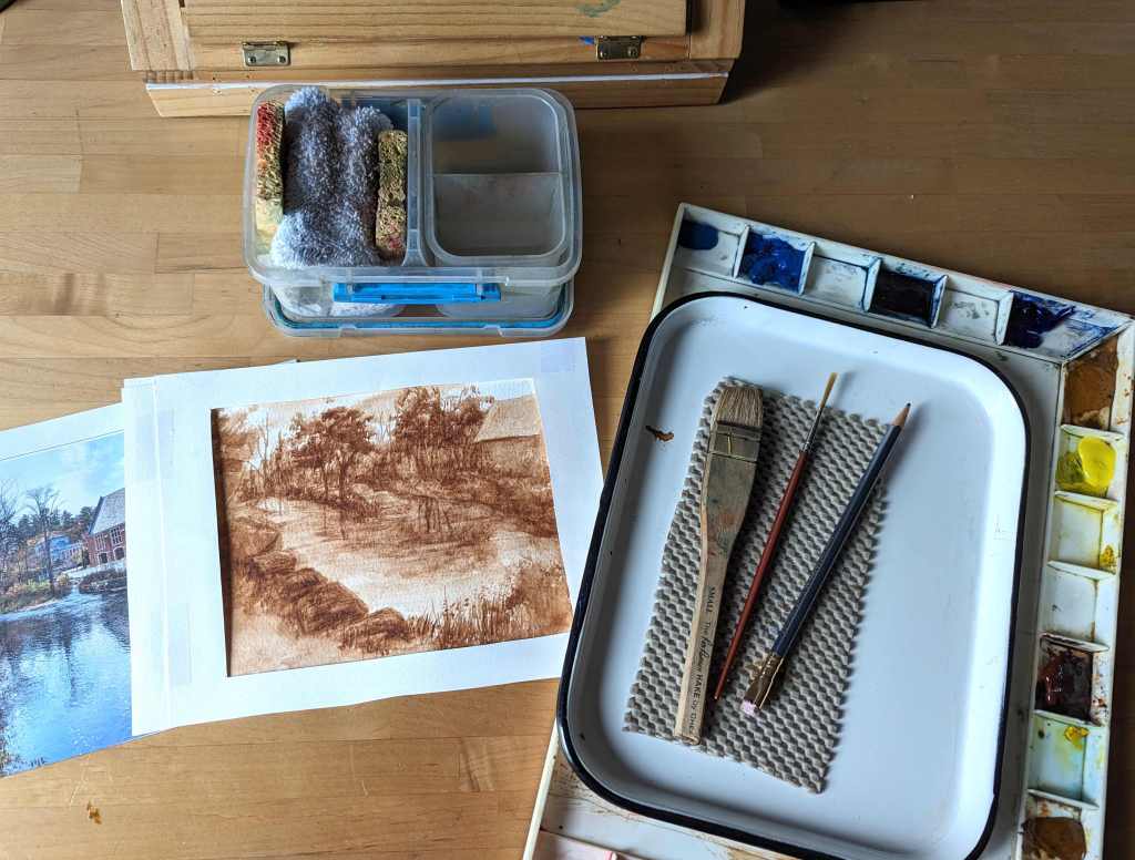
I looked at each photo and asked myself, “What element captures my attention?” (That’s my “Draw What Drew Ya” Principle I speak of so often.) I decided I wanted wetland waters in the center foreground of the composition, with meanders in the middle, vanishing into a deep pine forest in the background. I got this far (see below) in my local meet-up group, then I was wise enough to stop because I lost momentum.

I set it aside for a day or two. When I went back to it, I thought I knew how to finish it, but I wanted to be sure. Answer? Head to the bathroom! Yes, I held the sketch up to the mirror and it was immediately obvious where the weak areas were. (No photo of the bathroom mirror, though. It’s hard for me to juggle a book and a phone camera at the same time.)

Still not sure, I pulled out a large piece of tracing paper, laid it on top of the painting, and added in some quick pencil lines on the tracing paper to “test-drive” my idea.

I thought I’d have it finished in no time, but I got carried away and added more definition to the lower right side than I had originally intended.

The few grassy reeds poking up through the water/ice became a solid peninsula, and suddenly the waterway looked more like an obstacle course than a gentle wetland. What to do?

Back to the bathroom, of course.

When I held the painting up to the mirror, it became very clear that I needed to do some excavation work and remove the entire lower right peninsula. It’s no coincidence that the colors I use most of the time are transparent non-staining ones. By staying loyal to one brand (Winsor & Newton) and a fairly limited palette, I have gotten to know not only how to mix the precise colors I want but also their chemical makeup and how they will behave. With very little effort, I lifted the offending peninsula, and added a few foreground grasses to invite the viewers’ eye into the picture plane, the design itself guiding the viewer through and around.

I’m satisfied with the resulting painting of a place that almost exists in real life. Almost. Anyone driving by that wetland would recognize the area immediately, but they will never find the spot where I saw that view because it simply doesn’t exist.

Except now it does. Right here.

*******

Feel free to forward this post to anyone you think might enjoy it.

If you find these posts valuable, please consider making a contribution of any size to The Tip Jar. It is a secure site, it helps keep this website solvent, and is greatly appreciated!

 Questions? Comments? Public comments can be posted below.

 Private questions or comments will reach me by using the Contact link here.

 And, as always, thanks for spending some time “aloft”!

Posted in photography, Seeing and looking, Sketching tools, Watercolor | Tagged , , , , , , | 1 Comment

Your artistic license is mandatory.

I have heard people say, apologetically, that they took “artistic license” when they changed a scene they were trying to draw or paint. I get it, but they’re wrong to apologize. The truth is, your artistic license needs to be used often; it is basic equipment.

Here are three quotes from my brilliant mentor of many years, Ron Ranson:

Design: “What seems to divide excellent and lasting from mundane and forgettable works is the underlying design control…Nothing really separates the amateur painter from the professional more than this basic abstract organization of elements.”

Choices: “Realize that as an artist, you have the power to select or reject. Use the scene before you only as a starting point.”

Simplicity: “Simplicity can only be achieved by forethought, planning and insight. It actually takes much more effort to create a bold simple painting, than to endlessly worry and poke a picture to death.”

I do love the way he talks.

I believe that good design instincts are innate in many of us, and happily that inner knowing can be sharpened and improved through study of design winners and losers. That’s the purpose of this post, and I’m happy to share both of mine!

I started with this photo that I took recently while walking through the campus of a nearby boarding school. I was enchanted by how a formal staircase and Narnia-esque lamppost appeared out of nowhere as my friend and I strolled along a woodland path.

I thought, “Right, I’ve got it. All I have to do is a bit of cropping and editing and voila, this’ll be easy.”

Despite doing a few cursory thumbnail pencil sketches of the design, I still made the mistake of letting the center of interest drift to the center (Design No-No #1).

What a disaster! I forgot that the only way to give the viewer that same “aha” experience I’d had, of a half-hidden distant woodland staircase, was to keep the stairs in the distance! Instead, I zoomed in by mistake, thus eliminating that enticing foreground. Not a speck of paper was left white either, it was all soaked with hesitation and self-consciousness. The curious lamppost became a mere add-on, and although you might not be able to tell, I did “worry the paper to death,” rewetting, lifting, repainting, criminal behavior really.

Finally, thankfully, I gave up. There was an audible sigh of relief from that page in my sketchbook.

Two days later though, I decided to give it another go. I’m in the middle of rereading the chapters in “Big Brush Watercolor” where Ranson gives vivid examples of how photos can be used and even combined to inspire a credible, imaginary scene that began as a mere twinkle in the artist’s mind.

I chose a photo of the nearby river and campus buildings as a context for this staircase and added a bit of sky to broaden the view.

Here are the two photos:

I looked at both images for a long time.

Then I closed my eyes, literally, and just sat, breathing slowly. I imagined how that scene might look in rural England, where a boys’ school, located across the river from a small mill town, might have a walking path through the campus forest.

I saw it in my mind, smiled, opened my eyes. I drew two or three faint pencil lines to orient myself to the page, and the rest was done in no time.

Here is how the final design looks.

It was more fun, more creative, more liberating, than any slavish loyalty to a photograph, even a good one.

Takeaways:

As some of you know, I am in the middle of writing the second edition revisions for Look at That!, my sketching primer I published in 2020. A couple “Bobbie-isms” I may include are, “Think or Paint: Never both at the same time!” or “Painting is NOT a contact sport!”

Give yourself time to do the design work in your heart first. Let the design come to you. When you transfer the image in your mind to your paper, pretend every pencil line costs a dollar, and every brush stroke costs $5. Pause, paint, smile, pause, paint. Doesn’t that sound like more fun than, “Argh! Ugh! I suck at this! Where’s the eraser? Why did I use staining colors? I want to lift that!”

Ssssh, no, no, no, breathe. As Mihoko taught me, “It is only paper. No one will die.”

Remember: you draw, and paint, and sketch, and pause to look around you for joy, and joy alone.
There is no homework, only heartwork. And even that can be play if you let it be.

*******

Feel free to forward this post to anyone you think might enjoy it.

If you find these posts valuable, please consider making a one-time contribution of any size to The Tip Jar. It is a secure site, it helps keep this website solvent, and is greatly appreciated!

 Questions? Comments? Public comments can be posted below.

 Private questions or comments will reach me by using the Contact link here.

 And, as always, thanks for spending some time “aloft”!

Posted in Beauty, Books I Love, Design Basics, Seeing and looking, Watercolor | Tagged , , , , | 3 Comments

I never have to sit waiting for the pencil to start

I just spent a chunk of time trying to open a properly-saved file on my computer that, for some reason, now needs to be recovered. Couldn’t do it.

That file was a blog post draft in MS Word, so instead I looked elsewhere, to other blog posts drafts saved within my WordPress app. When I clicked there, I just watched the beach ball spin, thinking, “Any second now…now?…any second now…bad internet connection?…frozen?” No luck. After a bunch more time spent restarting and fiddling, I glanced at my watch. I was stunned to see an entire hour had passed, just trying to get going on something, anything, on a fidgety day.

Have you ever had a morning like that, when you’re restless and you decide to tackle something easy, and even THAT doesn’t work?

I look outside, thinking a stroll might help. The flagpole flag across the street is whipping straight out horizontally, writhing in an attempt to escape the relentless north wind. Nope, no sketching outside for me today.

So what do I do? I have a bad case of “Giddey-Up-Whoa.” It’ll pass, it always does. But the question remains, “What to do in the meantime?”

Here’s where an “In Case of Emergency Notebook” comes in handy. It’s a little something I invented several years ago, and it has saved me more than once. Let me walk you through it.

It’s an A5 size looseleaf notebook (about 5.5” x 8.5”) which I keep in a safe place on the bookshelf. It has three sections:

1- To EMTs: If I need rescuing, and I have my wits about me at all, I pull out this section that has the names of my MDs, my meds, my allergies, and my emergency contacts.

2- To EXECUTOR: In case the EMT’s fail at their job, my brother knows where to find this book. This section has all the vital info he’ll need: the name of my lawyer, my bank details, the main passwords on my computer. I was the executor of my mother’s estate, and she had all her final instructions carefully written out for me. Even still, she often quizzed me about those wishes during those last few years of her life. It made it easier to talk about it, and we both got to laugh at her need for control beyond the grave.

3- I’m BORED! : This is the spiritual triage section I use before the EMTs are needed. You might think this section is the least important of the three, but I use it far more often than the other two. When I am having a fidgety, bored, pointless, existential day, I know I don’t have access to my right mind, let alone insight or wisdom. That is when I need to be reminded of what I love, what lifts my spirits, what is accessible and most likely free, that will set me back on track. I add humor too; that always helps. Here are some examples:

Physical:

1- Walk over to the gym (which is a block away). Go in, turn around, walk out. Give yourself credit for going to the gym.

2- Turn on Pandora and find Stevie Wonder or The Indigo Girls or any dance music. Dance enthusiastically through two whole songs, precisely because no one is watching.

3- “10-Minute Tidy”: Set a timer (wind-up timers are great) for 10 minutes and race around the room and see how much stuff you can put away in ten minutes. You’ll be surprised. Remember, this is Triage Tidying Only: you must stop after 10 minutes (that is, unless you’re having a really, really good time).

4- STRETCH! Stand by the foot of your bed, back of your knees touching the bed. Now with your hands over your head, stretch as far as you can, fingers spread wide apart, toes stretched too. Stretch every joint you can think of, pretend you’re being tortured on the rack. Then, with an enthusiastic “AAARGHH!” exhale all the air in your lungs and flop back on the bed. Take another deep breath right there, in and out, and admire that gorgeous ceiling. Stay there until you can imagine doing something that’s even more fun.

Sitting Time:

After I’ve addressed my need to physically shake off a funky mood, I look at my favorite sitting activities: reading, writing, drawing, and painting. This time, I reach for my timer and set it for 30 minutes to get me started.

1- I’ll read whatever novel I’m in for 30 minutes guilt-free, or

2- I’ll study my latest art instruction book (Ron Ranson these days) and keep going for half an hour, or

3- I’ll go through the photos on my computer and set aside the ones that might be contenders for paintings, or

4- I’ll choose one of those photos and explore creating a series of different compositions, with different horizon lines, viewpoints, perspectives, or

5- I’ll fill my water pot on my dedicated art table, look through my composition sketches and find one that inspires me to try a juicy watercolor value study using only burnt umber, or

6- I’ll feel so good after walking to the gym and back and doing a 10-Minute Tidy that I just might sit down, turn on the laptop, and tap out a letter to myself, disguised as a blog post to you.

When all else fails, getting back into my body first seems to work best. Walk, stretch, work off some steam, then read a real book I hold in my hands, or pick up a piece of paper and an old-fashioned wooden pencil and draw using the side of the lead to create large, shaded shapes that inspire instead of delicate lines that constrict. Or I can write, which is another form of drawing: sketching with words.

And finally, there’s water.

Drink it when it’s clean. Paint with it when it’s not.

What more could you want?

Posted in Beauty, Musings on Life, Pencil sketching, sketching, Watercolor | Tagged , , , | 6 Comments

“Look at That!” Second Edition will arrive Spring 2024

On August 27th, 2023, I wrote an enthusiastic post about the work I am doing on a revision of Look at That! So clear-headed. So excited. So methodical.

Then Life happened. I can smile as I write that now.

Long story somewhat short, I experienced yet another retinal hemorrhage on September 20th that was far worse than the eight previous ones. This is no fun for anyone, but when you only have one functional eye, it can feel like the beginning of the end of life as you know it.

(Anyone out there not know what I’m talking about? Have you not read my memoir, Double Take, published a year ago? Its 230 pages and 155 illustrations cost only $5.99 on Amazon eBook/Kindle, and as you all must know, you don’t need a Kindle device to read books on Kindle. You just need the free app on your phone, tablet, or computer. People with diminishing eyesight love the accessibility of eBooks because we can enlarge the font to whatever size feels comfortable. Give it a try. There’s no need to give up your passion for printed books, you can enjoy both. It’s a luxury not afforded to everyone.)

So, back to my story. In late August I was rewriting a book. In September my eyesight was so distorted that reading, writing, and even walking became very challenging. So, I paused. Life invited me to slow down, breathe, and use up a bunch of Kleenex too…

After my ninth retinal injection on September 26th, the distortions slowly began to recede.

I began to breathe again, to regain hope, and as I looked around, I realized I had lost a full month off of my publishing schedule.

Then one day in early October when I was having tea with a good friend, she said, “Rather than pushing to stick to that original plan of publishing by November 15th, why don’t you consider postponing the book launch to the spring? By then people will be feeling spring fever, they’ll want to be outside again, full of inspiration to buy the new version for their best friend. Then they can go out sketching together once a week like you do with your friend Patrick.”

I smiled and nodded. She continued, “Besides, you keep coming up with new ideas to include in the revision, and you don’t want to publish before that final best idea arrives, right?”

I do have the wisest friends.

So, for now, the first edition of Look at That! is still available and is a wonderful gift for you or any loved ones with itchy fingers or twitchy creative hearts.

About my artist’s memoir Double Take: the paperback version is $24 USD because 230 pages of full color is expensive to print. I won’t be hurt if you prefer to get the $6 eBook version. Both include all 155 illustrations. (Previews of both versions are available on Amazon or in your local bookstore.)

Here’s part of the book description of Double Take:

“If you’ve ever wanted to peer over the shoulder of someone drawing in their sketchbook, listen to them struggle with their artwork, watch them cheer at an unexpected victory, and deal with progressive blindness, well, here’s your chance.

“Double Take is a true story, the back story behind my first book, Look at That!
My goal in that first book was to inspire people to look, and see, and sketch, and fall in love with eyesight.

“The hardest part of writing Look at That! was keeping it concise. Now, in 
Double Take, I get to tell you everything I left out of that first book. This is the real “why” behind my writing Look at That!

~~~~~~~~~~~~~~~~~

I must admit, it feels great to add six months to my publishing agenda for Look at That‘s Second Edition. Much of that pressure, of course, was created by posting that last blog page here 54 days ago. Once again, I see that containing my enthusiasm about a new adventure has never been my strong suit.

Time to wrap this up and get on with my day. Here’s today’s life lesson:

Give yourself permission to regroup.

If you’re anything like me, you hate disappointing yourself as much, or more, than you hate disappointing others.

But remember, appointments and disappointments are all constructs of the mind.

You can change your mind, then watch your heart soar yet again.

A beautful New Hampshire day in August. I will return!

*******

If you find these posts valuable, please consider making a one-time contribution of any size to The Tip Jar. It helps keep this website solvent and is greatly appreciated!


Feel free to forward this post to anyone you think might enjoy it.

 Questions? Comments? Public comments can be posted below.

 Private questions or comments will reach me by using the Contact link here.

 And, as always, thanks for spending some time “aloft”!

Posted in 3- Magic: Art Epiphanies, Beauty, Book #2: Double Take, Look at That! book, Look at That- Second Edition, Musings on Life, Seeing and looking, sketching, Writing | Tagged , , , , , | 4 Comments

My book “Look at That!” is getting a makeover!

Three years after publication, and after over 5,200 copies have sold on Amazon alone, I’m thrilled to announce that my first book is getting a major makeover.

The changes feel substantial to me, and yet I realize that when you see the new version, you might just smile and say, “It’s still the same book, just a bit better.” And you’d be right, but there will be one huge change:

Finally, there will be print on the spine! In other words, “It will no longer look spineless!”

What’s wrong with this picture? What are those two blank-looking books?

Does it really matter that there is no print on the spine, that it doesn’t say those five simple words, “Look at That – Bobbie Herron” along that skinny ridge?

It certainly does.

No brick-and-mortar bookstore will carry books that have no print on the spine for one simple reason: they don’t sell. They don’t sell because they don’t “shelve” well. (See photo above.) Beyond that, sadly yet understandably, most public libraries will not even accept the gift of a “no-print-on-the-spine” book.

That is why almost all my sales have been through Amazon. No bookshelves, no problem.

This serious design flaw, made back in late 2020, was not an oversight, far from it. I had so many go-rounds with the designer, endless delays, and we were way past my initial deadline for publishing. When the final cover file was sent to me, I said with polite exasperation, “The writing on the spine was there in the approved draft sample, but now in the final version, it has vanished. Please fix asap.”

It was only then that I learned the design he created was too few pages to have print on the spine. I was told at the time I needed 100 pages minimum, a far cry from its final length of 72. To add 28 more pages would have been a 39% increase (!), requiring an entire redesign and additional chapters. It was far too late to make the changes and still publish in time for the 2020 holiday book sales season, so I took a deep, sad breath and had to let it go as-is.

In truth, by that time I was so burned out on the entire self-publishing process that I was eager to be done with it. By the end of November 2020, I was convinced this tiny book had been simply a vanity project. I had no idea it would end up on the Amazon best seller list with over 400 mostly-glowing reviews. What a delightful surprise that has been these last three years.

Is a minor revision possible now?

Earlier this year, I discovered that “100 pages” is not the minimum book length for a printed spine (as I was told back in 2020), but instead only 80 pages were needed! Hurrah! I eagerly began working on a plan to salt in those additional eight pages to get my grand total up to eighty, while also making a few minor changes. I was humming along, staying within the prescribed “maximum 10% changes” publishing rule for the whole book, ignoring the many minor changes I might have made had there not been such a rule. Keep it simple, get it done easily, quickly, and for free: that was my goal.

Then a week ago I stumbled across an additional detail hidden in the fine print:

“The 10% maximum change rule also applies to the number of additional pages allowed.”

The math was simple. Adding the crucial 8 pages is exactly one page, ONE PAGE, more than I am allowed to add to this first edition. 72 x 1.10 = 79.2, not 80. No, they don’t round up. If there had been 74 pages to begin with, I could have slipped in six more pages easily, but 72 pages is a deal-breaker.

My soul flashed back to the many publishing frustrations of the Summer of 2020. Expletives were muttered. I was fuming.

But then a few hours later, while I was washing dishes and trying to think about other things, an effortless insight arrived, a nugget of universal wisdom about Life Itself.

Suddenly, my soul went from:

“I am so angry I now have to go through the expense and hassle of creating a Second Edition, just to get that print on the spine!”

to

“I am so excited! I now get to create a brilliant Second Edition!”

That’s the nugget: When you shift “I have to” into “I get to,” everything changes.

You might be thinking, “Bobbie, you’ve lost me. What’s the difference between making changes to a first edition, and publishing a whole new Second Edition?”

What is a “first edition” anyway?

A book can still be called a first edition if only minor changes are made to it. That’s for good reason: if someone recommends a book they read last year to a friend, the friend should be able to buy it now and get the same book, or a very close version of it. You can fix a typo here and there, or adjust a tiny graphic element, but it should be essentially the same book. That’s the reason for the “maximum 10% changes” rule. It’s hard to stay within that guideline if you really love your book and want to improve it as much as possible.

The good news, if you stay within that 10% restriction, is you get to keep the same ISBN, all the online reviews, all the Good Reads reviews, all the bestseller status history, your Library of Congress number, etc., because all of that is tied to the ISBN (International Standard Book Number), found on any copyright page. It is your book’s one-of-a-kind DNA code.

What if you can’t stay within that “10% change guideline?

The bad news is then you have a lot more work and expense ahead of you, not in editing the book, no that’s the easy part. The difficulty, and expense, is in making sure your Second Edition is connected everywhere to the first edition, including reviews, recommendations, etc. The publishing costs for a Second Edition are more like that of a brand-new book, with extra effort and expense to carry over the history from the first edition to stay with the second. That’s where my original angst came from. Put simply: many more things can go wrong.

The good news is now I get to fix absolutely every little thing I want! I know the revised version will still be enough like the original that it will easily pass for a Second Edition rather than a brand-new unrelated book.

The fundamental difference will be in my level of delight: now I can fix, change, add, delete, improve everything including the layout itself. Add more space to breathe. Have clearer contrast, more visual appeal.  

Best of all, I’m working with a new designer who 1) knows the software inside out and 2) is blessedly easy to work with. Her sense of aesthetics is similar to mine, and she intuitively understands the principle of “Less is More.” This is so important in a heavily illustrated book: the last thing you need is for the layout to be arm-wrestling with the illustrations for your readers’ attention.

The next cover will remain essentially the same (except for the addition of that beautiful new spine!), and the book itself will still be concise (about 84-86 pages, I think). I have no deadline, although releasing the Second Edition this November, three years after the first, would be kind of sweet.

So here’s my question for you: How would you like to help me?

Many of the minor adjustments I am making are thanks to reader comments I have received in the last 3 years. For example, the “Infamous Purchase Order” (current page 65) needs to be simplified. The resources on page 67 will change a bit because some of those are no longer available, and I want to add other wonderful artists (like Hazel Soan) to the list. Some of the current images will also be replaced with clearer ones.

Here’s how you can get involved: if you have a paperback copy of “Look at That!” and have studied it:

Were there any pages you found confusing?

Were there any sections that you thought needed more information, or another illustration?

Were there any sections that perhaps should have been simpler?

Would adding an index be helpful?

Is the print size user-friendly?

Anything else?

Write to me soon, either here in the comment section below, or privately using the contact page link here.

This is going to be so much fun, I’m glad I have sketching buddies to tear me away from my laptop regularly to go outside with them and…Look at That!

Posted in Look at That! book, Musings on Life, Writing | Tagged , , , , , | 1 Comment

What does global warming have to do with watercolor? 

(Note: This isn’t a quick read, but it’s well worth your time.)

Marc Taro Holmes gave me my first glimpse of this connection between art and climate change when he published his seminal work, “Apocalypse Variations” in 2019. The art in this book is nothing like his previous loose line-and-watercolor work.

“Apocalypse Variations” touched my soul. The artwork is fluid, dark, and ominous. The text is compelling.

“I’ve been a plein air painter for most of my twenty-five years as a working artist. Painting on location is tremendously effective training. Enough practice translating light and space writes new pathways in the brain. The ability to see, understand and simplify…. These paintings turn out to depict dark, hopeless expectations which can’t be discussed openly in polite society. I feel that honest despair about the future is seen as weakness. People don’t want to hear it… I’m talking about the state of the environment, the climate, just everything. It’s something, as a landscape painter, you can’t avoid thinking about.” – Marc Taro Holmes

His passion, his sense of urgency, helped spur me on to create a fresh approach to teaching the “why bother?” of watercolor. That inspiration led me to write “Look at That!

A few months after publishing my first book, I stumbled across this brilliant work by HRH, The Prince of Wales (now King Charles) entitled Harmony,” published in 2010.

I purchased the audio version first; soon after that I also bought the eBook version so I could read along while listening to the impassioned inflections in his familar voice.

You hear the clarity, the wisdom, and the frustration in his voice. He points out that worldwide collaboration is the only possible environmental solution. You might think a lifelong visionary environmentalist who was also the future king of England might have the power to initiate global changes. But no, he too has had to “think globally, work locally.” Collaboration requires community consensus.

A month after reading and listening to this book, I came across the captivating documentary “Royal Paintbox” (released in  2014).

I recalled the message Marc Taro Holmes had pointed out two years prior:

When you sketch outdoors in the wild,

you fall more deeply in love with the wild. 

When I spend time carefully observing (and sketching) my surroundings, I create a new relationship with whatever I am looking at. Years later, when I walk past that garden or that house or that stone wall, I smile inside because I recognize our secret. At first I thought to myself, “That’s my garden…” but that’s not quite accurate. I’m acknowledging a relationship, not an ownership. It’s more like recognizing, “That garden is a part of me now.”

Those of you who sketch outdoors know exactly what I mean. 

To recap so far: 

I began regular plein air sketching in January 2013.

I began teaching sketching for the joy of seeing in October 2017.

I read “Apocalypse Variations” in June 2019.

I wrote “Look at That!” during the summer of 2020, publishing it in November 2020.

I discovered, bought, and fell in love with Harmony in January 2021.

I first watched “Royal Paintbox” Feb 5, 2021.

I bought the book, “HRH The Prince of Wales: Watercolours” , a collection of 160 paintings, on February 8, 2021.

By then, as you can guess, my plein air heart was bursting at the seams. Something had to give.

So I wrote a letter.

To HRH, The Prince of Wales.

(Yes, I included a copy of “Look at That!”)

——————————————————

February 17, 2021

Dear Sir,

I am sending you this book as a token of my appreciation for your book, Harmony, which I am now reading. It inspires me, especially when you wrote on page seventeen:

“There is one other principle or quality I would draw attention to. I will refer to it a lot throughout this book because, in my view, it is extremely important. It is the quality of beauty . . .  Our ability to see beauty in Nature is entirely consequential on our being part of Nature Herself . . .  if we do not value beauty then we ignore a vital ingredient in the well-being of the world.”

Perhaps in your time drawing and painting, you too have discovered that once you have drawn or painted any subject, your relationship with that subject is changed forever. Whether the subject is a stonewall or a cathedral or a flash of sunlight on a mountainside, upon completing a sketch or painting I have a deep, effortless love for that thing of beauty which held my gaze for a brief moment in time.

A few years ago, I spent a bit of time creating a small watercolour of some fresh vegetables I had purchased for making supper. Once the sketch was completed, I tried to look at my still life through the eyes of a cook rather than an artist, and much to my surprise I could not bring myself to take a knife to those potatoes! How barbaric it felt to even consider it! I asked my roommate to make supper that night, and she got a good giggle out of it. I, on the other hand, had experienced an epiphany.

Imagine the shift that would happen if a critical mass of individuals were to discover what we already know? What if they could see the fragility and beauty inherent in all of our surroundings, at every moment?  Might they too become effortless stewards of Nature, rather than savage consumers?

I realize Your Royal Highness may never see this letter, nor this book which I wrote last summer in hopes of introducing people to the joy of seeing unexpected Beauty everywhere. If the book remains with one of your staff, and one set of eyes opens, as well as perhaps one more heart, I will be pleased.

Page nine of my book states its mission:

“What if the marks that appeared on the pages of your sketchbook were the side effect of your sketching time, rather than the purpose?

“What if you shifted your focus to pleasure rather than results?

“My bold promise: you might be on the verge of falling in love—with looking, with seeing, and finally with sketching.”

Perhaps falling in love with the Beauty of our planet, and finally seeing it for the first time, is the missing link to the Harmony we crave so deeply.

Gratefully yours truly,

Ms. Bobbie Herron

bobbie@aloftwithinspiration.com

I certainly never expected a reply, not even a form letter. Three months later, much to my surprise, I received a letter from his office at Clarence House that was cordial, acknowledging my book in a way that leads me to believe my letter, as well as my book, made it through to the intended recipient.

——————————————————

So what on earth inspired me to tell this story now? New hope, that’s what.

Three days ago, I came across a 109-minute video from early July 2023 that scientifically, poetically, and passionately, pulls it all together.

In this video entitled “Why do Humans Exist?” Chervin Jafarieh and Dr. Zach Bush discuss our dire environmental situation and yet happily, by the end, they airlift us to see the solution from a higher plane than I ever knew existed. These two people, with knowledge, grace, and eloquence, connect more dots than I thought were possible.

A fair warning: I know some of you will dismiss this video because it is “too long.” I understand. Set the video aside until you have a couple of quiet hours ahead of you to chop vegetables, do some yoga stretches, or rest on your bed. But please, give yourself the gift of their wisdom. If you know you are too impatient to watch all 109 minutes, fast forward to 50:17. If you watch from then until the end, chances are you’ll rewind to the beginning just to see what you missed.

The fact of global warming is no longer theoretical nor predicted for some distant time in the ostrich-head-in-the-sand future. It is happening right now, right here. We are sweating physically and mentally, while we are spiritually wringing our hands, assuming it is too late, too late, too late.

When it seems the world around us is “dis-integrating,” there can be only one solution: connection. Collaboration. “Re-Integration.”

We’ve already had a glimpse of the possibilities!

We witnessed global environmental healing begin in the summer of 2020, when humans were forced to “go to their room,” in a planetary time-out to consider our future. In the meantime, Mother Nature did what she does best, went into overdrive, mending the rivers and air first, because water and air are essential to all life forms.

It was Global Triage Time.

It was wondrous, even amid all the deaths and suffering that occurred. Perhaps the grandest lesson from the pandemic is that humans must become teachable again, to stop talking and strategizing, and just shut up and listen for a change. 

Look. Listen. Collaborate. If you’re not the praying type, you can simply look at the world around you, observe what is thriving despite man’s efforts to dominate. Look, notice, and applaud the natural world.

Consider your own spiritual condition because its fitness is key to being humble enough to listen. To learn. To face the fact that nobody wins unless we all win as a planet. Throw out all those man-made constructs that divide us, grab a bucket, or a teaspoon, and start bailing out this beautiful sinking ship in whatever way you can. Collaborate.

That 109-minute video will give you hope. So will all the books I recommended. An hour spent outdoors, sitting in the shade, sketching our beautiful, struggling planet, wouldn’t hurt a bit.

You can pray or meditate.

You can stop buying needless items in a futile attempt to fill your soul.

You can bite your tongue before an unkind word passes your lips. 

You can share what you love, not what you hate.

You can say, “How can I help?” then notice how good it felt to say those four words.

Gratitude and perspective can open doors you never imagined. They are the WD-40 of Life.

Add to that a gentle creative habit, and your world (and heart) will open in unimaginable ways. It has for me.

*******

Thank you for reading this long, impassioned call to gentle action and hope. Please forward this post to any artists, environmentalists, other humans, or publications you think might appreciate it. Every nugget of hope helps, and you can be a part of the collaboration right now!

Questions? Comments? Public comments can be posted below.

Private questions or comments will reach me by using the Contact link here.

And, as always, my much-appreciated Tip Jar link is here.

Above all (literally), thanks for joining me in some time “aloft”!

Posted in 3- Magic: Art Epiphanies, Beauty, Look at That! book, Musings on Life, Seeing and looking, sketching, Urban Sketching (On-Site Creativity) | Tagged , , , , , , | 2 Comments

The Perfect Cure for Your Next Creative Stall-out

Do you ever feel like sketching, but you don’t feel like sketching?

By that I mean, do you ever feel like playing with your pens and paper and watercolor toys, but you have no interest at all in finding a subject matter? Here’s my 100% satisfaction-guaranteed recipe for inspiration:

Simply schedule 47 private weekly coffee dates with an encouraging, good-humored, well-known artist.

Enticing, right? I’m serious, you really can, it only takes 3 steps:

1- purchase the fun-filled informative book shown below

2- once a week, take it with you (along with your sketchbook and portable art kit, of course) to a café or park on your weekly artist’s date

3- read five pages in the book each week, then sketch to your heart’s delight!

If you’re anything like me, after five pages you’ll want to keep reading, yes, but you’ll be equally eager to start sketching immediately. After 47 weekly sessions of 5 pages each, you’ll find you have finished reading all 235 glorious pages, and magically your sketching skill, confidence, and joy will be through the roof!

“Life is Better When You Draw It,” by Koosje Koene

I speak with some authority when it comes to knowing what encourages shy or stuck artists. My first book, “Look at That!”, has enjoyed best-seller status for well over two years and has sold over 5,000 copies worldwide. I’m so grateful for the wonderful reviews and I know those reviews on Goodreads and on Amazon have helped to drive those sales. That is exactly what I want to do for my friend Koosje Koene, because her book is well worth every penny, pound, or peso.

For those who may not know her, Koosje (pronounced “Co-sha”) is a cofounder of Sketchbook Skool which began in 2014 and went on to become the revolutionary online art school that changed my life and the lives of hundreds of people. Koosje has produced over 420 “Draw Tip Tuesday” videos on YouTube, generously offering them to all of us for free, to help us each move our creative lives along. Her spirit and enthusiasm show in everything she touches.

Many of us, including me, are spoiled by her infectious enthusiasm in her videos. I wondered how on earth that lively, expressive spirit could be captured in book form, and I admit, that is exactly why I hesitated to order her book when it came out in July 2022. And yes, I thought the same thing you might be thinking: “I DON’T need another art book, no matter who wrote it!” Nevertheless, thank goodness, I finally ordered my copy of Koosje’s book a month ago, and all I can say is, “Better late than never!” This is not, IS NOT, just another art book!

Another confession, this a happy one: I am only halfway through reading it because I don’t want it to end. I am highlighting often, rereading the best bits with a smile, and studying every drawing in detail. So yes, I do average about 5 pages per sitting because the content is so delightfully rich, like chocolate cake.

Most of the traditional art instruction books I own have a dog-eared bookmark stabbed somewhere in the middle of them, right where my slogging perseverance finally gave out.  No chance of that happening here because this book is not traditional “art instruction,” although you will learn a lot by reading it.

Life is Better When You Draw It” falls in that rare, enticing category halfway between art instruction and memoir; its storytelling approach teaches by example rather than by direct instruction.

Artist memoir may be my favorite genre: these books (like “Everyday Matters” by Danny Gregory and my own book “Double Take“) show you first “why bother having an art practice,” so that you get a taste of all the benefits before you even approach the challenging and enjoyable learning curves.

Inspiration first, curiosity to explore more second, then, finally, information: that is how I learn best.

Seen for yourself what you think of this sampling:

Page 37- Why use a sketchbook instead of individual sheets of drawing paper

“[With separate sheets of paper instead of a sketchbook] it was easy to not “push through” a little; I’d start a drawing and when I didn’t like it, I’d stop, crumple up the paper, and start over. That, I can tell you, is a way to get frustrated about the process very quickly! … [With a sketchbook], you can give a drawing a little more love and not give up on it before the process even barely takes off… If you had binned it, the learning curve would have stopped right where you disqualified the drawing.”

Her generous illustrations on every page show a vast range of techniques, skills, and the willingness to simply enjoy mark-making. From fineliners to bold brush pens, Koosje uses them all with playful finesse.

From fineliners to juicy fat markers, play with them all!

The joy of drawing with a brush pen, ah yes. Although I had used calligraphy pens and fat felt-tip pens to draw in the past, I still shied away from these super-flexible bold brush pens. But then I read this: “This tool helps me to loosen up, and the brush tip prevents me from getting caught up in the details. You can also see how all the practice has helped me to be more playful, which brings more life to the page.”

The joy of drawing with a brush pen.

… and the next time I was in the cafe I made sure to bring a brown brush pen with me. This was the result– such fun! An instant way to get over your shyness, get past those first “careful” marks. Just go for it! Dive in!

My favorite cafe, drawn first with a fat brown brush pen!

It takes practice to develop any skill of course, lots and lots of practice, but once you switch your approach to “let’s have fun” instead of “I need to get better at this right away,” then all the learning becomes simply play!

“Your sketchbook is your playground, your classroom, and your creative gym.” The next time you head out sketching, just tell your friends you’re hitting the gym!

Finally page 60 (on the left), in case you’re still not sure you can do it.

“Even a bad drawing is better than no drawing at all.”

Final Note about Self-Publishing: Koosje and I each took on the monumental task of self-publishing our books, and it is not for the faint-hearted.

The additional challenge for self-published artists (as opposed to novelists) is that illustrated books, especially heavily illustrated books, do not translate well at all to an eBook version. So don’t be disappointed that this amazing book is only available in paperback format. There’s a very good reason for that, and once you have it in your hands you’ll understand. The paper and print quality are outstanding, unlike any other paperback book I own. Koosje’s book design is so rich, so complicated, so brilliant (her designer Tosca Lindeboom is a genius), and you have only seen a tiny bit of it here.

Do yourself a favor and buy the paperback as soon as you can. This book deserves to be in your hands, literally.

Here’s the link again, and remember, ordering from The Great British Book Shop is the best way to go. It is economically better for the well-deserving author, and you will receive it for the same price and just as quickly as you would if you had ordered it from Amazon. Remember to leave a review on Goodreads or anywhere else you can, including in the comment section below. I’m eager to hear your reaction to this delightful book.

*******

If you find these posts valuable, please consider making a contribution of any size to The Tip Jar. It helps keep this website solvent and is greatly appreciated!

As always, feel free to forward this post to anyone you think might enjoy it.

Questions? Comments? Public comments can be posted below.

Private questions or comments will reach me by using the Contact link here.

And, as always, thanks for joining me in some time “aloft”!

Posted in Beauty, Books I Love, Pen & Ink, Pencil sketching, Sketchbooks, sketching, Sketching tools, Urban Sketching (On-Site Creativity), Watercolor | Tagged , , , , , | Leave a comment

My Ultimate Toolkit for Plein Air Watercolor Enjoyment

As promised last week, here is the story of the latest “Ultimate Plein Air Watercolor Set-up.” This time, yes, I think I’ve nailed it.

Warning: If you are not a watercolor painter, or even if you are and you never want to paint outdoors on location, you may find this blog post ridiculous.

On the other hand, if you do paint outdoors whenever possible, and you find it frustrating, get ready for some great news. You may already have most of the supplies you need, so the cash outlay could be quite small for the return in joy you will discover.

It all started once upon a time with three metal palettes acquired over several years. Here they are, sitting together like a happy little family.

12-, 24-, and 48-pan palette boxes.

The small one on the left may look familiar: it holds 12 half-pans, or 6 full-pans, and has been my reliable companion for more years than I can count.

Next, one size larger, is the Mama Bear of metal palette boxes made to hold 24 half-pans, or 12 full-pans. Being made of metal too, it is a noticably heavier.

Finally, the Papa Bear size, designed to hold (you guessed it) 48 half-pans, or 24 full-pans. When fully loaded with paints, it is four times as heavy as the junior size one on the far left.

I confess, I bought this largest one four full years ago and I’ve never used it as designed, not even once. It wasn’t expensive, but once I had it in hand, I knew it would be useless for me out on location because of its weight when fully loaded. What was I thinking? Still, I knew it had potential…

Then I discovered my Inner Inventor!

I asked myself, “What is the hardest part of plein air sketching?”

“Is it balancing the sketchbook and a simple pencil?” Never.

“How about a sketchbook, a water-soluble pen, and a water brush?” No problem.

“What about a sketchbook, a tiny palette, and a water brush?” Still no problem.

All I need is a clip, a water brush, and my well-used, trusty Demi Palette by Expeditionary Art.

“But what if I want more? What if I want to use:

  • a few of my regular watercolor brushes I love,
  • with a cup of real water,
  • and a reasonable selection of watercolor full-pans,
  • and have plenty of space to mix up deep, juicy puddles of color,
  • while sketching standing up, perhaps leaning against a tree,
  • easily holding everything I need,
  • with no chance of spilling it all over my sketchbook as the whole thing tumbles to the ground?
  • What if I want to do that?”

I now have the answer!

Step 1: Brushes

Gather up your five favorite brushes, no more. I recommend a #8-10 round, a ½” flat, a rigger, possibly a #4 detail brush, and a big fat brush, like a 1” flat.

For the “big flat” I use a well-loved, much-used Ron Ranson hake. It takes quite a lot of practice to get used to a hake, so substitute any big flat brush you like for those giant juicy washes.

Here are my current workhorse brushes:

Small detail brush, #2 rigger, #8 round, 1/2″ flat, small Ron Ranson brand hake (handle sawed off to fit a travel box.)

Step 2: Tack

Grab a small wad of poster putty/ blue tack, whatever it’s called in your country. I used this for all sorts of things.

Step 3: Colors and palette guts/ frame

If you have one of those small palettes full of pans of your favorite paints already, open it up and pull the frame out. This is easily done; just leave all the colors in the metal frame and pull the frame itself out. When empty, the frame looks like this:

Below are photos of the small and mid-size frames filled with my favorite half-pans and full-pans. (I currently am using the mid-size frame.)

Small frame with the middle gap area filled in with pans too. “Well-used” can look a bit messy!
Mid-size frame: Mostly the same colors in both frames, various blues, yellows, reds, as well as a couple neutrals. No tube greens, I mix mine.

If you hoard art supplies, there’s a good chance all you’ll need is the “Papa Bear” empty 48-color-size Meeden palette box. It’s about $18-20 at common online stores, including Amazon. If you can only find the “52” half-pan size, that’s fine. You’ll be using that poster putty to keep things secure anyway.

Step 4: Assembly time!

Have some of that poster putty handy, you’ll be using it. Get out your new Meeden palette box and remove the frame inside. You can set that aside for use in the distant future if you like. This photo shows the empty box with poster putty in strategic locations. It weighs next to nothing.

Make sure you have a bit of putty in all the strategic places, then press in your color frame, brushes, and maybe include a bit of cut hard plastic if you like, to use for scraping effects. Here are photos of both versions:

Large box with small color frame.
Same large box, with mid-size color frame.

Step 5: But what about the water?

I’m so glad you asked. Years ago I purchased a little clip-on double turpentine holder, available from any art supply store. The wells were not deep enough to hold the amount of water I wanted, so I used poster putty to adhere two old 35mm plastic film canisters inside the cups (makes it easier to not spill the water too). You could use small prescription/pill bottles instead. I fill one bottle with water and leave a bit of sponge in the other one. Dabbing your brush on a sponge right after you rinse your brush is a great habit; having the sponge right next to the water makes it even easier. Here are the photos. Note: I tuck a bit of towel between the palette flap and the water container to make sure it’s a good solid fit.

Turp cups with film canisters installed.
Turp cups safely hooked to left flap of “large “Papa Bear” palette box. Notice that lovely dirty sponge in the left cup!

Step 6: The board that hooks your paint and water to your sketchbook

Cheap or free are my favorite ways to invent things. Coroplast (also known as Biplex, Polyflute, Proplex) is corrugated plastic, a very versatile material used in some DIY applications, as well as for printing roadside advertising signs. You can purchase it at DIY stores or art supply stores, but I have an even better place to get it if you’re patient and clever.

Close-up of coroplast board end.

The thing is, this stuff is not environmentally friendly at all. That makes it durable for outdoor lawn advertising signs like roadside event notices, real estate for-sale signs, and political campaign signs (ample here in NH every 4 years). The sad news is that after the walkathon is complete, the festival is finished, or the election is over, those signs often become roadside litter, getting blown into the hedges and tall grass near roads, eventually broken into bits but never becoming useful compost.

I found the board I use now while walking along a road a few years ago. It was spattered with dirt and debris, but it rinsed off easily and makes me smile every time I see its proclamation of “Fest” and “–ncord, NH.”

Here are pictures of my well-used board which is cut to purpose (notice the 1″ notch cut along the top edge.)

Now all you do is insert that 1″ board slot around the entire set of paper in your bound sketchbook (see below), then open the book to the page you’re working on, and clip the open pages to the back and front covers. See below again. It’s far more secure than you would imagine!

Lift up all the pages to slip the board into place.
Simply clip the covers and the pages on each side open to the page you’re working on. Easy!

(It works fine with a spiral-bound book too- just open your spiral sketchbook to the page you’re working on, tuck the board between the covers, and clamp it. If you’d like further instruction on that, email me at the contact link above, and we’ll talk.)

Finally, the fully opened palette box (complete with paint, brushes, water, sponge) gets clipped on the right side to the board which is underneath. Now you simply hold it on your free hand, palm facing up, like you’re a waiter proudly holding a tray in a five-star restaurant.

Ta-dahh! Your fully loaded set-up!

Look at all those big beautiful color mixing areas on the far left and right! That’s what I wanted most of all: to have room to create big puddles of premixed paint, so when I work wet-in-wet in a gentle breeze, the mixes don’t all dry up before I’m finished!

The entire kit, including board, sketchbook, palette kit and water pots measures a mere 8” x  10” x 2.25”tall, and weighs in at slightly less than 2 pounds or .85kg. Lightweight and very portable.

Ready to pack into your small art bag.

Step 7: Go outside and play!

This winter I tried it out here in my home, and neighborhood, and all went well. Now that it’s springtime, I took it for a real test drive at the seacoast, where a gust of wind out of nowhere is to be expected. No problem!

View at Kittery Point Beach, April 28, 2023…
,,, and my painting of the day.

The kit worked perfectly. It will take some practice to get the set-up sequencing down to a routine but all in all I’m very pleased. I like it even better because I’ve walked you through all the steps so you can create one for yourself if you like, or a customized version that suits you even better. This was much more fun than taking one photo and saying, “Look what I invented, ta-daaaah!”

Creativity comes in many forms, including repurposing and reinvention. Do whatever it takes to make your plein air time as joyful as possible. I did.

The experience of painting outdoors, with all its multisensory stimulation, is not to be missed. The sounds of birds, the scent of the sea breeze, the barking of dogs in the distance, will mix magically in with your paint, and it will show in your final masterpiece du jour.

Make it as easy as possible to enjoy your time sketching and painting. That’s the whole point, right?

*******

If you find these posts valuable, please consider making a contribution of any size to The Tip Jar. It helps keep this website solvent and is greatly appreciated!

As always, feel free to forward this post to anyone you think might enjoy it.

Questions? Comments? Public comments can be posted below.

Private questions or comments will reach me by using the Contact link here.

And, as always, thanks for joining me in some time “aloft”!

Posted in Beauty, sketching, Sketching tools, Urban Sketching (On-Site Creativity), Watercolor | Tagged , , , , , | 6 Comments

Say no… so you can say yes.

Your time is precious.

Sometimes my time feels so precious, and I have so many creative ideas, that time flies between blog posts as it has done lately. (Your overflowing inbox appreciates that though, I’m sure!)

This is why it’s so important to minimize the time you spend on things you don’t want to do, so you have more time available for your soul-filling joys.

This time-management challenge has been going on since the first artist, writer, inventor set foot on earth and then got either hungry or chilly. Dang, I have to stop to make lunch. Or drag out my wolf-skin parka. But I’m busy making stuff! I have to eat and sleep, but no, I’m not coming over to see your new baby brontosaurus.

So it’s true. We have to say no so we can say yes.

This week I read a brilliant article by Laura Pritchett, in the April 16th issue of the Colorado Sun. Here’s a quote:

“My other all-time favorite out-of-office reply came to me from the poet Camille Dungy, who quoted Charles Dickens on the subject. She pulled a few awesome lines from a “sorry, I can’t” type of response he wrote to a friend: 

‘It is only half an hour’–’It is only an afternoon’–’It is only an evening,’ people say to me over and over again. But they don’t know that it is impossible to command one’s self sometimes to any stipulated and set disposal of five minutes — or that the mere consciousness of an engagement will sometime worry a whole day. These are the penalties paid for writing books. Who ever is devoted to an art must be content to deliver himself wholly up to it, and to find his recompense in it. I am grieved if you suspect me of not wanting to see you, but I can’t help it; I must go in my way whether or no.’

“I snorted in delight when I read this one too. And surely this is applicable to everyone, not just authors. An invitation for “a cup of coffee” will eat up a half day, and, indeed, change the course of our entire days, and although I love a cup of coffee with a friend as much as the next person, I’m also unwilling to parcel out my time when I just can’t.”

Honestly, I could highlight every word of her article. A classic on this subject of time management is Time Warrior by Steve Chandler. Highly recommended. The challenge for us all is to streamline the “must do’s” so we have more time for leisurely “wanna do’s.”

Slow sketching

I am one of the slowest sketchers I know. It’s not that I don’t know how to draw or paint, or that I’m flooded with hesitancy. No, just the opposite.

I’m in love with gazing.

Early spring day full of watercolor self-hypnosis.

More than anything, I want to “draw what drew ya,” and that takes time. If I’m waiting for a bus and know I have 17 spare minutes, sure, I’ll pull out my sketchbook and enjoy the time. But by far my favorite way to sketch is to go somewhere that is visually pleasing, and just sit with no awareness of the passage of time. A few motionless minutes will pass, then I notice I’ve just done a double-take, spontaneously looking at something twice, smiling with curiosity. More often than not, that becomes my subject. I’m drawn to curious juxtapositions and large shapes that play well together. The object itself can be innocuous, but the composition feels compelling.

That’s precisely the sort of soul-enhancing experience that will elude me if my time is too jam-packed with schedules and chores and social obligations.

No matter how old you are, you don’t have long to live.

Remembering that fact will help you be mindful of how you decide to spend your time here on earth. If your creative outlet is drawing pictures with your grandchildren, or designing and planting a prize-winning garden, or inventing a watercolor kit that answers every wish you ever had (to be revealed in the next blog post!), then you simply must design your day around your creative priority. If you don’t, you will slowly develop a quiet despair and eventually start wondering what’s the point of this life after all. I’ve been there. It’s not a nice neighborhood.

There are 168 hours in a week. If you sleep a delicious 8 hours a night, that leaves 112. If you work 50 hours a week and commute 10 hours a week, that still leaves you 52 hours. That’s on average over seven hours a day that’s all yours to design. This may be your greatest work of art so far!

Sustenance: I usually spend a chunk of time once a week on food planning and prep. Veggies get chopped, soup gets made and some goes in the freezer, the week’s simple food plan gets taped to the refrigerator. No time wasted on Decision Fatigue later in the week.

Admin: Although I’m retired, I have a whole cluster of chores I call “Admin” that could easily steal my joy if I let them. It’s things like paying bills, managing the marketing/sales of my two books, Etsy site, and things like that. And finally, and by far the biggest challenge, Managing the Email Inbox. Ugh.

I can’t be cavalier and just ignore it. My inbox is where I hear from long-lost friends, get fan mail from new readers of “Look at That!,” and receive important alerts if my finances or identity have been compromised. All those things need timely action. But what about all that other email? Sisyphus comes to mind, sadly.

Here are the two top tips I’m using at the moment for Inbox Management:

A wind-up timer. I set the timer for 30 minutes most days to work on inbox-clearing or answering emails. Then when the bell goes off, I finish whatever email I’m in the middle of, and close that tab. Leave it. Move on to stretching or walking around a bit, reclaiming my space.

Unsubscribe Magic. This technique hit me like a blast of fresh air when I first discovered it. I open my inbox, then type the word “Unsubscribe” into the search bar. Voila, instantly you will see all those auto-generated emails that may have interested you at one point, but now, not so much. Then it’s a few easy steps:

1- I open a newsletter I no longer want, then follow the unsubscribe process.

2- Next, use the search bar again to locate all the newsletters from the source I just unsubscribed from.

3- I select all of those, hit delete, and Voila, success.

4- Finally, type “unsubscribe” in the search bar again and repeat.

Yes, it’s a slow process, but faster than weeding through them one by one. Note: I do this while listening to a favorite podcast because this inbox work is utterly mindless, and the podcast keeps me entertained.

Once you’re caught up, it’s easy to maintain. If you’re on a roll and having a great time slashing and burning through that inbox when the 30-minute timer rings, reset it for another 30 minutes and knock yourself out.

My trusty timer is a magic shield, guarding me from the evil monster called Overwhelm. With Timer’s gentle ticking, I can safely navigate through the tedium of tasks I dread.

After all these years, that timer bell still reminds me of my childhood, when that “bbbrrriiing” meant the made-from-scratch chocolate chip cookies had finished cooking. A sweet memory. Now the timer bell sounds like freedom, another sort of dessert, I suppose. It announces the freedom to move on and start refilling my soul in whatever way I please.

On page 63 of “Look at That!”I included a quote from William Henry Davies:

“A poor life this, if full of care,

We have no time to stand and stare.


I wish you many moments of carefree staring.

*******

If you find these posts valuable, please consider making a contribution of any size to The Tip Jar. It helps keep this website solvent and is greatly appreciated!

As always, feel free to forward this post to anyone you think might enjoy it.

Questions? Comments? Public comments can be posted below.

Private questions or comments will reach me by using the Contact link here.

And, as always, thanks for joining me in some time “aloft”!


Posted in 3- Magic: Art Epiphanies, Beauty, Musings on Life, My Story, Writing | Tagged , , , | 2 Comments